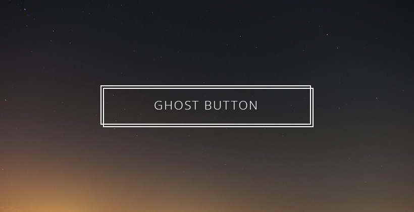
Ghost Button Web Design Trend
One of the big web design trends of 2015 has been Ghost Buttons. These are buttons that have an outlined shape with a hollow centre rather than a solid button with contrasting coloured text inside. The result is less chunky and intrusive. This style follows on from the popularity of flat UI design and can be seen in a wide variety of examples.
Since the introduction of IOS7 this feature has been becoming more prominent.
It can even be seen on the Apple TV interface.
One of the most impactful uses of ghost buttons is to have them placed over a photographic image background, as it defines the clickable area without detracting from the image based composition.


The fact that this effect can be created using CSS rather than image files further adds to their popularity.
Ghost buttons are a stylish and minimalist addition to a contemporary website design. However bare in mind that they are not suitable for the look and feel of every site.


No Comment