Rebranding Time!
Yes it’s time for a rebrand. Of course this is not something that you should do too often but when you are a designer and you feel that your logo is looking dated it’s hard to resist freshening up your image. The key with branding is always evolution rather than revolution. Even if your business is not a household brand name which is instantly recognisable by millions it is still the face of your company with which many of your clients and customers have come to associate you. So don’t completely change it over night. Keep at least some features in order to stay recognisable as that same company which has gained their trust and loyalty over the years.
That being said, times change and you have to move forward. Here’s the old logo:
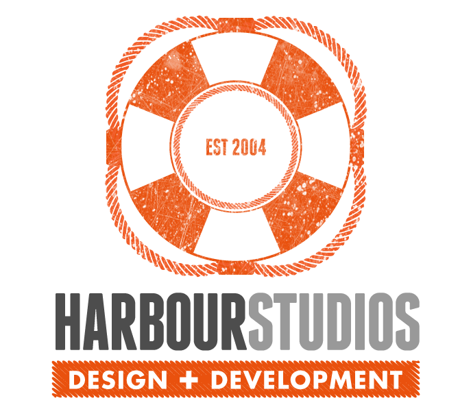
So what’s new? Most noticeably and most impactfully the font. The font in the previous logo was Avant Garde Gothic. This has been replaced with Franchise Bold for Harbour Studios and Futura for the tag line. These two contrast nicely with each other. The strong tight, upright gate of Franchise has a punchiness and statement of intent while Futura is rounded and expansive. This creates a resonance which keeps your eye moving back and forth from one to the other.
The tag line has changed from “Creative Agency” to simply “Design + Development”. The plus sign adds more of a modern edge than an ampersand would. It is written over a scribbled orange block. This frenetic scribbled effect injects an energy and enthusiasm into the logo which practically screams out “lets go!”
Gone is the blue grey colour in the font, replaced instead with two tone grey lettering. The tonal variation separates the two words Harbour and Studios without the need for a space. Previously the two words were stacked on top of each other. The orange colour from the life preserver icon remains as the only colour other than the greys.
The life preserver graphic is no longer inside the text acting as the o in Harbour. It now stands alone and larger, placed either to the left of the text or above it depending on the space that it needs to fill. Both representations are acceptable under our brand guidelines. The life preserver graphic now looks more retro with contrasting thin and thick lines. It has also been been given a textured effect making it looked weather. This gives it a contrast to the modern style of the text and strap line, tying in the old with the new.
Also new is the “EST 2004” text centered inside the life preserver. Bit of a popular trend in logo design you might say, and you’d be correct. But it does serve an important purpose in showing new clients that your business is established. If it has been around for ten years or more then the chances are it’s not going to go bust before the end of their project. It does seem strange though when businesses put “Established 2014” in their logo. Then it is just being done for the sake of the trend and only emphasises to clients that you are new on the market and may not have found your feet yet.
So there you have it. A new style for the new year ahead. Happy sailing.


No Comment