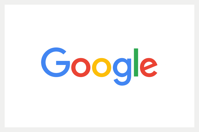
Google’s New Look Logo
Long standing aesthetics deniers Google have finally upgraded their logo. In fairness they have updated it a few times over the years but seemingly always with a strict mandate to keep it looking like it had been knocked up in Word.
Sticking with a simplistic look and feel to the logo and web pages has been a rigid brand ethos of the company for a decade and a half and this principled approach to a technology business has drawn a lot of admiration from many quarters. After all Google’s product was so good that they didn’t even need to bother with all the bells and whistles that other businesses required in order to garner respect and attention. But nothing lasts forever and now it seems that the omnipresent trend of flat UI has finally broken the Internet giant’s resolve.
So what do we think of the latest incarnation? Here is the previous logo to compare and contrast.
Gone is the grotesque font Catull which has been in place since 1999. If you’re not a font geek then I should explain that the expression grotesque isn’t a diss. It refers to a style of font that is conspicuous by the varying thickness of the line weight of the lettering. Neither is the new font style Serif. A serif font is one with the pointy bits sticking off the corners that give it a quite old fashioned feel. In contrast the new logo is Sans Serif meaning without the pointy bits, and is Geometric meaning that it has an even line weight. This gives it an overall more modern feel. The font type is very similar to Futura but is actually custom designed for Google.
There is a pleasing symmetry to the circles that echo through the letters and the letter E is still set at a jaunty angle. Nice. My only criticism would be that the inside line of the capital G feels slightly too long. However this is probably necessary in order for it to still be prominent when displayed on a much smaller scale. For example in the Favicon which has also been given a facelift.
It has to be said though that it is a little disappointing that a technology company known for its innovation and trail blazing is with its brand image merely following a trend rather than setting a new one. At the same time however I am glad that there’s something a little more easy on the eye to greet me when I open my browser.


No Comment