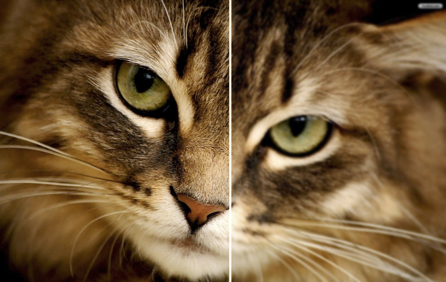
Website Image Resolution in 2015
When I started out as a website designer last century (seriously..1998) everybody knew that when you optimised a JPG, Gif or PNG image file for a website, that you set it to 72 dots per inch or DPI for short. This was because screens back then only displayed 72 dots per inch so anything over that was a waste of valuable bytes.
These days however we have HD, HDX and even Retina – Apple’s own high definition screen technology that they use on their iPhones and some MacBook models. Retina crams in many more smaller pixels into the display than does regular HD. So what does that mean for the image that we want to put on our website? If there are twice as many pixels to cover does that mean that a Retina screen will display the image at half the size? Thankfully not. The dots are so small that what would be one dot can be expanded over two Retina dots without the quality degrading to a level that you could consider that noticeable. So if we use a higher quality image instead would this look better on a Retina screen? The answer is yes – marginally. But you have to be looking quite closely to see the difference.
But even though it is just a small difference there is a difference in quality, and as digital artists striving to put out the best work should we now be saving all of our image files at the highest quality setting? Not necessarily. There is still file size to consider. Internet download speeds may be a lot faster than they were ten years ago but peoples patience for waiting for downloads has inversely plummeted just as much.
Basically we don’t need to think in terms of pixels per inch or dots per inch any more unless we’re dealing with print work. For on screen image optimisation, instead, aim for a reasonable trade off between quality and size.


No Comment